It is 2026 now. Almost thirteen years have passed since the first time I tried to build a blog of my own.
My last blog rebuild was almost two years ago as well.
So I could not resist rebuilding my blog again, and I named it ImI.
As for what ImI means, and why both is are uppercase, maybe it is like the Chinese internet phrase “何意味 (nani-imi)”: no meaning at all.
Or maybe, in this age where AI creativity keeps exploding, I just wanted to leave a little meaning for myself.
Hmm… Astro
The overall technical choice was actually simple.
I moved my blog to Astro quite early, and I once helped a friend build an Astro blog theme. I like to think I understand Astro reasonably well, so this rebuild should obviously be Astro… right?
The final answer was Yes 🙂↕️
But for a while, I did try building it on top of Waku. I even sent Waku a PR along the way.
The reason was straightforward. As a React developer, I still wanted my own site, and my articles, to have room for more interesting components and elements. The React ecosystem is also more familiar to me.
I love Base UI. More precisely, I probably love coss ui. Both only ship React component libraries.
Astro can of course bring in React components, but because this is my own project, I wanted the technical choice to feel a little more elegant.
For me, that setup was still too heavy.
Waku is not mature enough yet, especially around SSR. You can tell just from its current version number. The more painful part was the lack of Content Collections.
There are many alternatives, but in terms of completeness and update cadence, Astro’s first-party support is simply much stronger. Fuma Nama’s Fumadocs MDX is also worth mentioning here.
In short, after wrestling with Waku for a while, I was exhausted and returned to Astro’s arms.
It is light enough, familiar enough, and suitable enough for a content-first personal site that occasionally wants to sneak in strange little components.
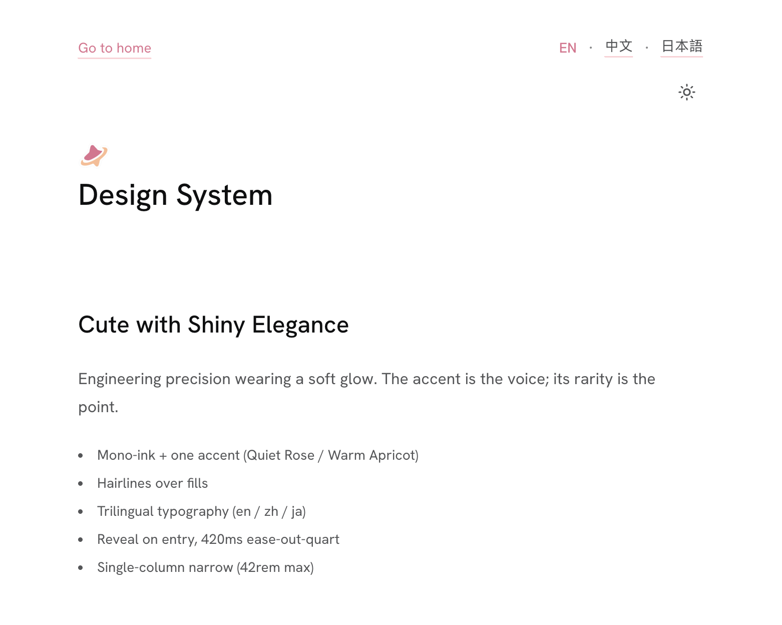
Color, typography, and CJK
I call myself a Design Engineer, so I spent a lot of effort trying to make this site show at least a little taste.
Of course, taste is dangerous.
It is very easy to write “I have a particularly refined idea” in your head, then end up with something that looks like the dark-mode version of a free template.
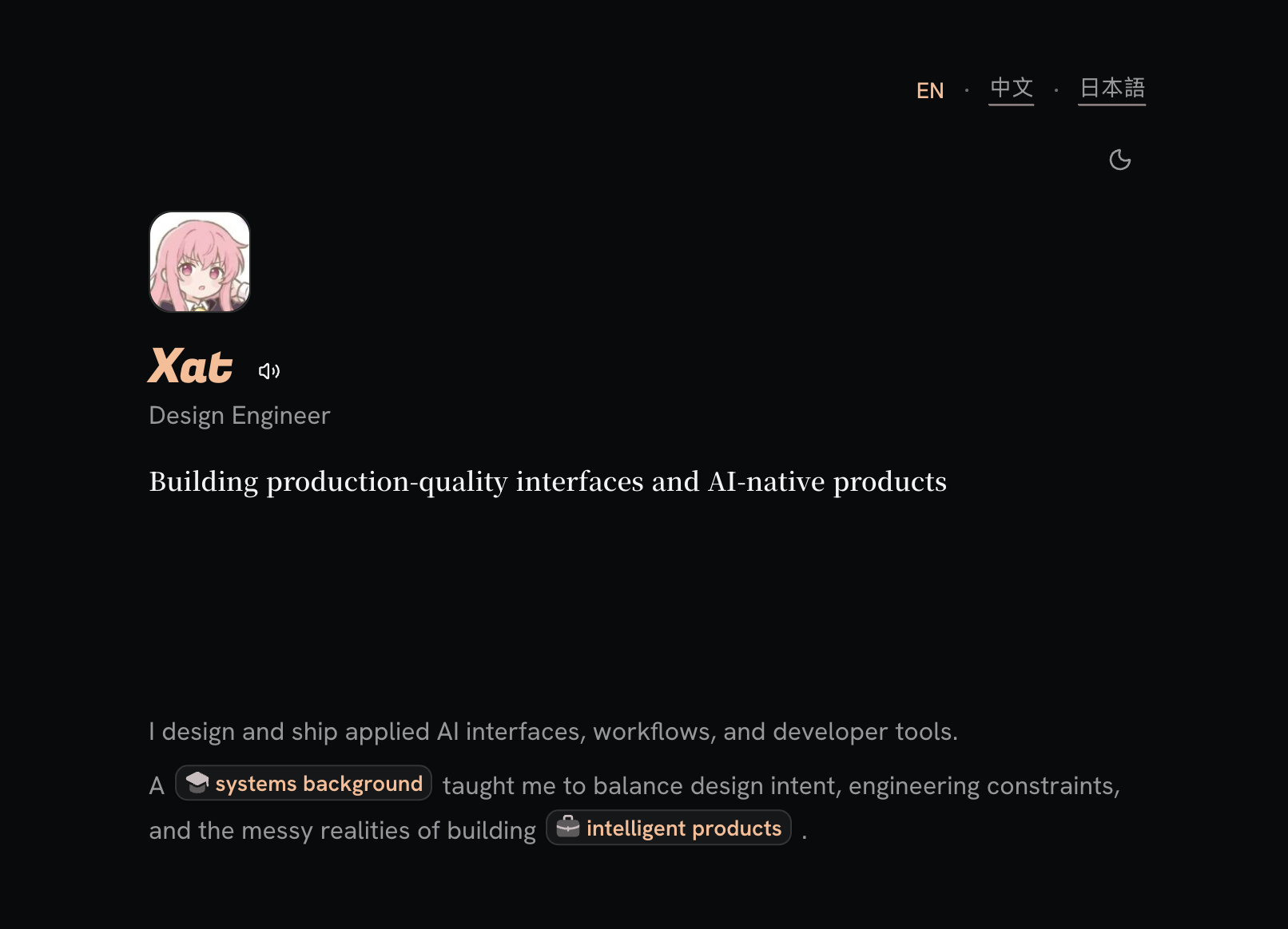
A little magic
After discovering Vesper, I fell hard for its palette and used it almost everywhere in my daily tools.
So it naturally became the reference for this site’s dark theme.
The wide empty space, the basic content hierarchy, and the accent color that only appears as decoration all come, to a large extent, from what Vesper taught me.
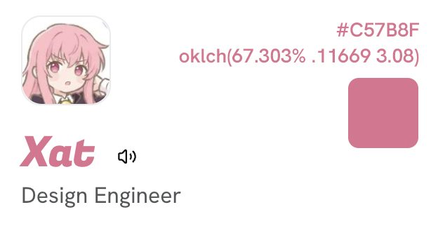
The light theme was inspired by Louise’s pink hair in The Familiar of Zero, the anime that pulled me into that world in the first place.
By the way, my current avatar is also an AI-altered Louise. It has lost a little of the original charm, but I am quite happy with it.
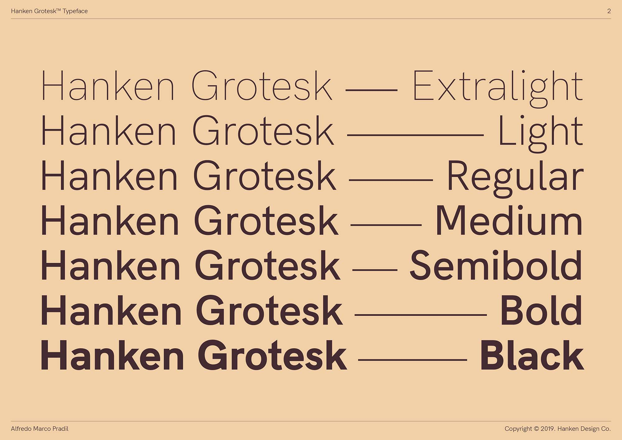
Buy it, sure, except I cannot
How can Aperçu look this good 😭
And how can the price be this unfriendly! ($60 for a single weight, $768 for the whole family, and that is before Webfont pricing.)
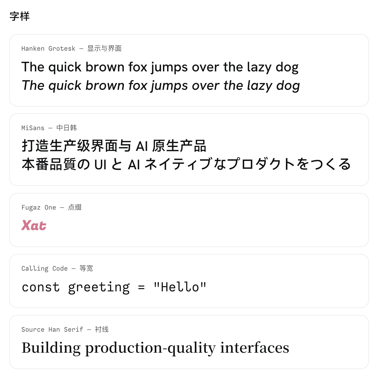
So I had to settle for the next best thing. After looking around, Hanken Grotesk matched my taste and was free. Wonderful.
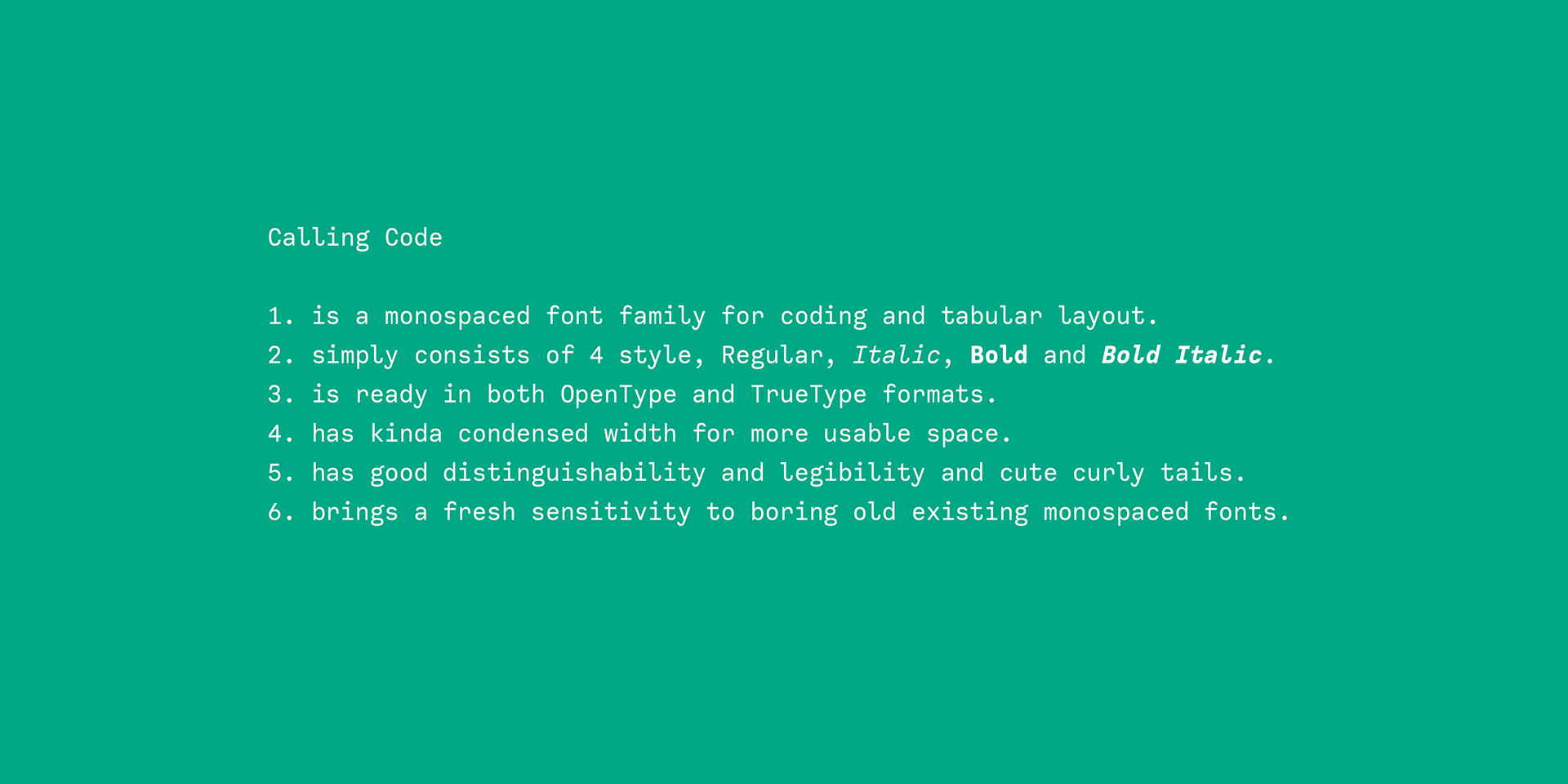
For monospace, I chose Calling Code. I like it a lot. Its reading experience was so good that I once wanted to use it as the body font, and I bought a license for it.
As for CJK, my first choice was MiSans.
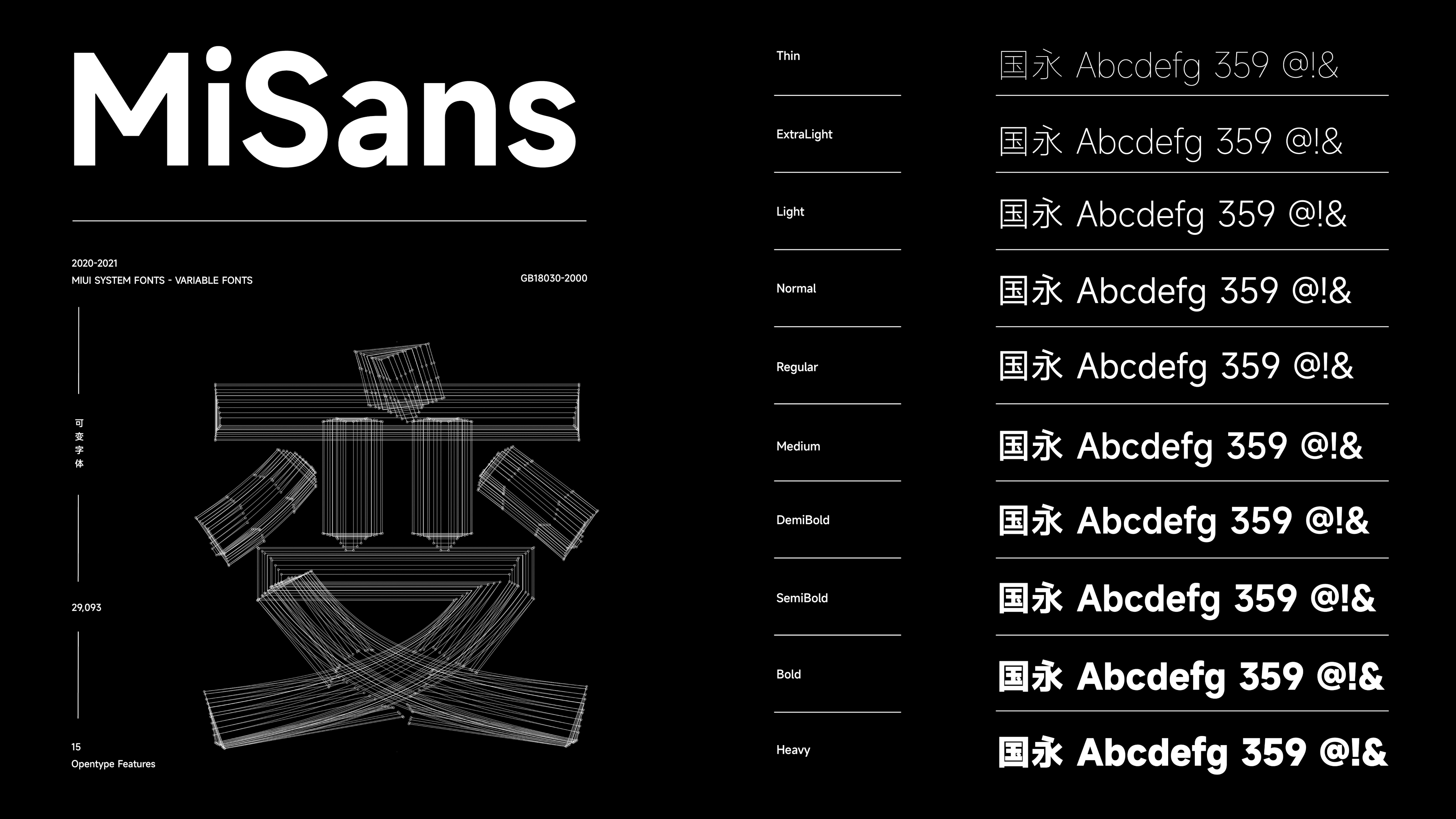
I am not a Xiaomi fan, and I have never bought Xiaomi-related products outside the Mijia ecosystem. But this typeface left a very good impression on me.
Sometimes this kind of decision looks like “just pick a font”, but for a Chinese site, typography almost determines the base texture of reading.
English typography can rely on many mature typefaces, spacing habits, and line-breaking conventions. Chinese on the web is much easier to distort through defaults. Especially with mixed Chinese and English text, a page can become cramped and fragmented very quickly.
So I would rather spend more time on fonts.
Fine, I am indecisive
Speaking of CJK fonts, that naturally leads to this site’s i18n setup.
It is not perfect. You could even say it is a little bad.
Because I strongly dislike putting /zh prefixes or suffixes in URLs, this site reads the browser’s preferred language and adjusts the displayed language automatically.
That creates quite a few problems.
First, the sitemap can only reliably include one language’s links. Second, OG images, canonical URLs, RSS, and other machine-facing surfaces are much harder to keep perfectly clear without language paths.
Since most of my articles are written in Chinese, I still treat Chinese as the primary language.
The funnier part is that, when building the site, most of the UI copy was written in English first and then translated back into Chinese. Some of the Chinese therefore reads strangely obscure.
I comforted myself by calling it a feature, and slowly tricked myself into accepting it.
For now, this site only supports Chinese, Japanese, and English, which are the three languages I can handle. Japanese is still in progress…
They share the same routes and the same content structure, while keeping separate handling for typography, line breaking, and copy.
It may not be the most correct i18n setup, but at least it is one I am willing to maintain.
Make myself happy
I am a long-time RSS user, and that has let me see many excellent designs.
Purely out of respect, I shamelessly borrowed many ideas from masters.
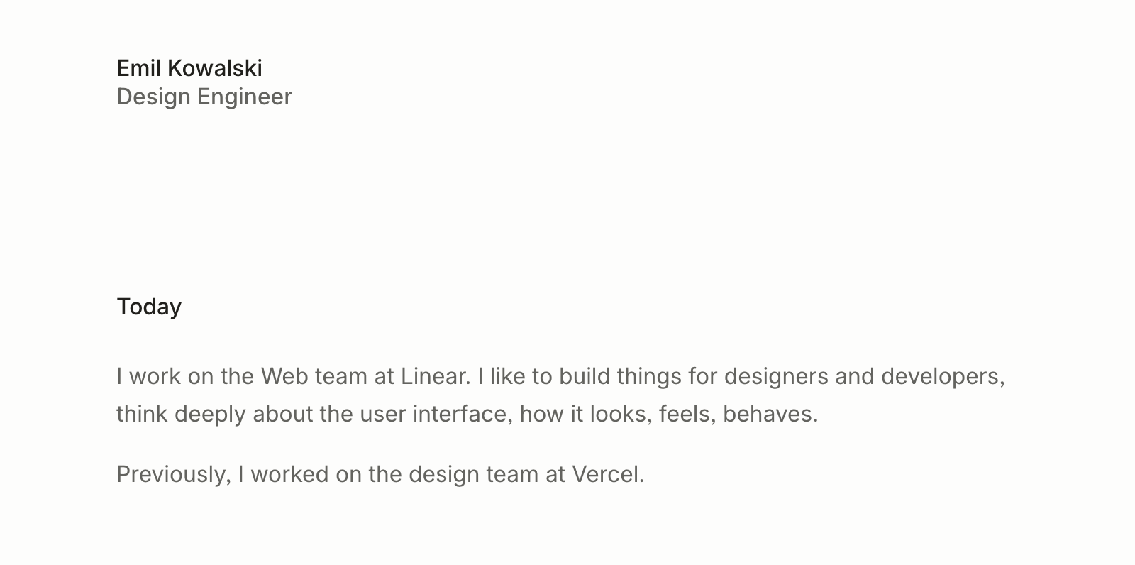
First, Emil Kowalski. I first knew him through Sonner, an elegant toast component that later became part of shadcn/ui. His Animations on Web course is also excellent.
The overall visual feel of this blog is heavily inspired by his personal site.
Then there is Josh Comeau, a frontend expert who has written many valuable articles across React, CSS, and animation. He also inspired me to add many small ideas to this site.
I am a loyal reader of his blog, and this year I officially bought his Whimsical Animations course.
Rauno Freiberg is a master. In my mind, he goes beyond the boundary between design and engineering.
The original layout of my blog was built almost entirely on top of his Web Interface Guidelines, though after rounds of iteration the prototype is slowly harder to see.
Jakub Krehel’s personal site also gave me a lot of inspiration.
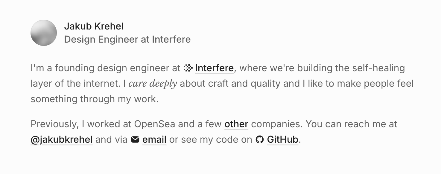
Ah, visiting his site again while writing this gave me more new ideas. It really deserves the phrase “that’s good work.”
While I was working on my own blog, Jace’s portfolio appeared on my X timeline.
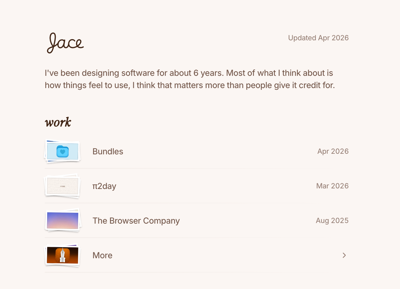
It was too refined.
That gave me a lot of inspiration and motivation too. The rounded underline style on this site was also inspired by him.
Maybe you have already noticed that this blog does not inherit the browser’s default scrollbar style.
Yes, I have always wanted to make a custom scrollbar. Roriri’s article, “The birth of an upper-class scrollbar”, is absolutely worth reading.
I imitated and rebuilt my own version from his site. It may not be quite as upper-class by comparison, but I hope it does not fall into the lower class either.
Elegant, cute, and then… details!
What really pushes a site from “looks fine” to “I am satisfied” is often not one huge feature.
It is the tiny details that are hard to explain, and sometimes not even worth the time on paper.
For example, MiSans and Hanken Grotesk do not align in visual weight. At the same font-weight, MiSans looks heavier than Hanken Grotesk.
Luckily both have variable fonts, so the most direct solution would be adjusting them with font-variation-settings.
Unfortunately, that does not work in Safari.
The new IE of our age.
So I had to manually generate several static weights, then map the visual weight of CJK back to the 400, 500, and 600 values used on the page.
There are also article reveal animations, the wanderer copy in the footer, the little toy on the design-system page, avatar preload, code-block themes, image galleries, and every other thing on this site that does not seem strictly necessary but that I simply wanted to make.
They are hard to put on a resume.
But I know they are there.
ImI, and goodbye
I love watching something I made slowly move from rough to complete.
The joy of creation is probably why I became a Web developer.
But I still feel far away from the title Design Engineer.
So I will keep my feet on the ground and build a little at a time.
Thank you for reading this far.
If you want to recreate this blog of mine, you may want to visit the design system page, where I put some of the more concrete details.